
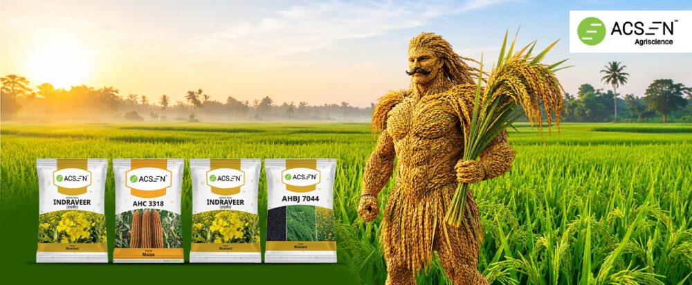
“खेत से बाज़ार तक” - Product Communication Across Four Hybrid Seed Launches
Building an Unified Brand Identity Across Four Hybrid Seed Launches
Background
The Indian seed market is highly competitive, particularly across staple crops such as paddy, maize, and mustard. Farmers are presented with numerous hybrid seed options that often promise similar agronomic benefits, making product differentiation increasingly difficult.
For most farmers, purchase decisions are not influenced by scientific terminology or technical specifications alone. Instead, they respond to communication that clearly demonstrates visible crop performance, better market value, higher productivity, and ultimately greater profitability.
About The Brand
ACSEN, a hybrid seed brand under the TransFARMING umbrella, sought to strengthen its presence among Hindi-speaking farming communities by launching four hybrid seed products across different crop categories. Rather than creating four unrelated campaigns, the objective was to establish a single visual communication system that would unify the brand while allowing every product to communicate its own unique value proposition.
The communication included four print and digital communication creatives:
- Dabang Plus – Hybrid Paddy
- ACSEN 3318 – Hybrid Maize
- Indraveer ACSEN 7034 – Hybrid Mustard
- ACSEN 7044 – Hybrid Mustard
Although each product addressed different farmer needs, the communication needed to feel like one cohesive ACSEN brand experience across retail counters, dealer outlets, and digital platforms.
Creative Big Idea
The campaign was built around the idea of “खेत से बाज़ार तक”, highlighting the journey from superior crop performance to greater farmer prosperity. Instead of focusing on technical seed features, the communication emphasized the outcomes that matter most to farmers: higher yields, better grain quality, improved market prices, stronger crop protection, and increased income. Each poster transformed complex agronomic benefits into simple, visually engaging stories while maintaining a consistent ACSEN brand identity, ultimately positioning the brand as a trusted partner that helps farmers achieve better harvests and better business outcomes.
Challenges
- Launch four hybrid seed products under one unified brand identity.
- Communicate distinct product benefits without diluting brand recognition.
- Simplify technical agronomic features into farmer-friendly messaging.
- Create a consistent visual communication system across all products.
- Develop creatives that perform effectively across retail, dealer, field, and digital touchpoints.
Target Audience
- Farmers cultivating hybrid paddy, maize, and mustard in Hindi-speaking regions.
- Progressive and small-to-medium farmers seeking higher yields and better profitability.
- Agricultural dealers and retailers who influence seed purchase decisions.
- Farming communities looking for high-performing, reliable hybrid seeds with clear, benefit-led communication.
Farmer Insight
Farmers rarely evaluate seeds based on scientific specifications.
Instead, they ask practical questions:
- Will my crop give a higher yield?
- Will I earn a better market price?
- Will the crop remain healthy throughout the season?
- Is this hybrid suitable for my local conditions?
- Can I trust this brand?
Visual proof often influences farmer confidence more effectively than technical explanations.
A strong image of healthy crops, abundant harvests, or confident farmers creates immediate credibility because it mirrors what farmers aspire to achieve in their own fields.
The communication therefore needed to convert invisible agronomic advantages into instantly understandable visual stories.
Strategic Thought
One Brand. Four Crops. Four Stories. One Visual Language.
Rather than treating every hybrid as a standalone campaign, the strategy was to create a repeatable communication framework.
Every poster would:
- Follow the same visual architecture.
- Use identical brand assets.
- Maintain consistent layout hierarchy.
- Highlight one powerful product promise using a unique creative device.
This modular system allowed ACSEN to scale communication rapidly while reinforcing brand memory across multiple product categories.
Creative Execution
1. Dabang Plus – Hybrid Paddy
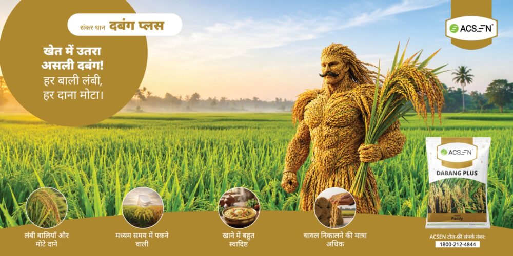
“खेत में उतरा असली दबंग! हर बाली लंबी, हर दाना मोटा।”
“The real strongman has arrived in the field! Every panicle is long, every grain thick.”
Communication Theme
“खेत में उतरा असली दबंग!”
Instead of showing a farmer, the poster introduces a larger-than-life mascot made entirely from paddy straw and grain.
The character physically represents the product’s promise.
Its muscular appearance symbolises:
- Long panicles
- Bold grains
- Strong crop performance
By turning the product into a memorable character, the communication makes technical benefits emotionally engaging.
Farmer Benefits
- Long panicles
- Bold grains
- Medium maturity
- Excellent cooking quality
- Higher milling recovery
2. ACSEN 3318 – Hybrid Maize
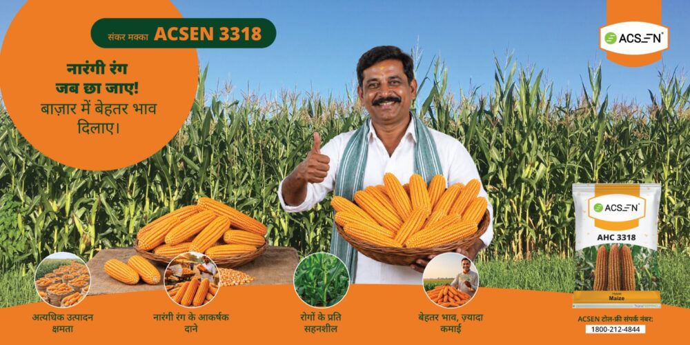
“नारंगी रंग जब छा जाए! बाज़ार में बेहतर भाव दिलाए।”
“When the orange colour takes over! It fetches a better price in the market.
Communication Theme
“नारंगी रंग जब छा जाए!”
This poster shifts from fantasy to proof.
A smiling farmer proudly displays bright orange maize cobs while giving a thumbs-up.
The vibrant kernel colour becomes a visual indicator of superior market value.
Rather than talking about pricing, the communication lets the crop itself become evidence of profitability.
Farmer Benefits
- High yield potential
- Attractive orange kernels
- Disease tolerance
- Better market price
- Higher earnings
3. Indraveer ACSEN 7034 – Hybrid Mustard
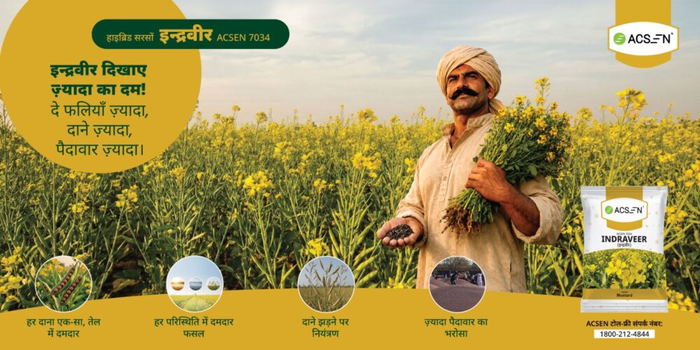
“इन्द्रवीर दिखाए ज़्यादा का दम! दे फलियाँ ज़्यादा, दाने ज़्यादा, पैदावार ज़्यादा।”
“Indraveer proves the power of ‘more’! More pods, more seeds, more yield.”
Communication Theme
“ज़्यादा का दम.”
The communication focuses on abundance.
A confident farmer stands in a flourishing mustard field while offering seeds directly toward the viewer.
The repeated use of the word “ज़्यादा” (More) reinforces the product’s promise.
- More pods
- More seeds
- More yield
This repetitive messaging makes the campaign highly memorable and directly aligns with farmer aspirations.
Farmer Benefits
- Uniform seed quality
- High oil content
- Robust performance
- Reduced pod shattering
- Higher productivity
4. ACSEN 7044 – Hybrid Mustard
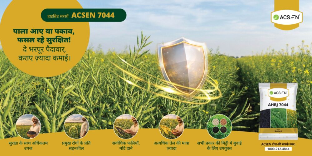
“पाला आए या पकाव, फसल रहे सुरक्षित! दे भरपूर पैदावार, कराए ज़्यादा कमाई।”
“Whether frost strikes or the crop is ripening, it stays protected! It gives abundant yield and earns more income.”
Communication Theme
Protection Creates Productivity
Unlike the other posters, this creative removes the farmer entirely.
A glowing protective shield hovers over the crop, symbolising resilience against frost and environmental stress.
The shield instantly communicates security, making an otherwise invisible agronomic benefit visually tangible.
This symbolic approach differentiates ACSEN 7044 from the rest of the campaign while remaining visually connected through the shared design language.
Farmer Benefits
- Maximum yield with protection
- Disease tolerance
- High pod count
- Bold seeds
- High oil content
- Suitable for all soil types
Results & Impact
The designs successfully established a modular communication system capable of supporting multiple product launches without weakening brand consistency.
Key achievements included:
- A repeatable visual identity across four hybrid launches.
- Improved product differentiation using tailored storytelling.
- Simplified technical product information into farmer-friendly messaging.
- Strong brand recall through consistent logo placement, pack shots, and design hierarchy.
- Hindi-first communication that aligned with the language preferences of the target audience.
- Benefit-led layouts that reflected how farmers naturally scan and interpret advertising materials.
- The communication demonstrated that a unified creative system can effectively communicate different product stories while strengthening overall brand recognition.
Conclusion
The “खेत से बाज़ार तक” digital communication demonstrates how a single, scalable communication system can unify multiple product launches while preserving the individuality of each hybrid. By combining a consistent visual identity with tailored storytelling ranging from metaphor and testimonial to symbolic protection ACSEN successfully translated complex agronomic benefits into simple, compelling messages that resonate with Hindi-speaking farmers. The result is a cohesive brand presence designed to improve recognition, simplify decision-making at the point of purchase, and reinforce the connection between crop performance and farmer prosperity.